Ever visited a website and the layout is all skewed? Images are cut off, the text is too big and the screen jumps all over the place as you scroll? Yeah, that’s not a mobile responsive website!
There is no excuse to not have a mobile-friendly website these days, and most web designers and developers will make a website mobile responsive by default. However it’s important you know what exactly responsive design is so that if you are building your own website or hiring someone to do it, you can ensure your website is mobile-friendly!
What is responsive web design?
Responsive web design is a design approach that allows websites to automatically adjust to suit different sized screens and viewports; i.e. desktop, laptop, tablet, smartphone etc.
Responsive design means that you can view a website from any device and it will still look and function just as well as it does on a desktop!
How does responsive design work?
I’ll try not to get too “techy” here.
A typical website is made up of a set of files, generally speaking, those files will include content (text and images), HTML code and Cascading Style Sheets (CSS).
CSS is how a website is styled, this includes colours, fonts, sizing, layout (plus a whole lot more), without CSS a website would look pretty meh!
HTML only

HTML + CSS
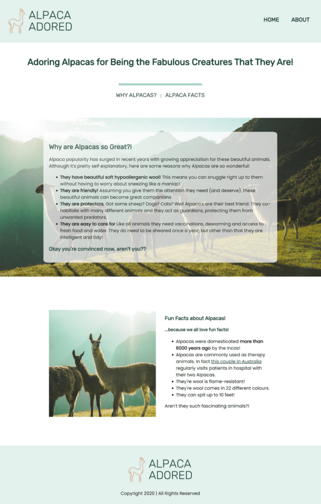
Psst… I built this super adorable alpaca site during Julia Taylor’s 5 Day Coding Challenge. Check it out here!
To make a website mobile responsive we use CSS to add extra “styling” so that a website not only looks good on a desktop, it looks good on any device!
I could go on… but I said I wouldn’t be too techy!
Now, moving on to the important stuff!
Why do you need a mobile responsive site?
As a website owner, it is in your best interest to have a mobile responsive website. Listed below are 3 reasons why mobile responsive design is important!
Half of your website traffic comes from mobile devices
In Q3 of 2020, statista.com reported that 50.81% of website traffic comes from mobile traffic! That is a huge proportion of the market that is accessing your website from a mobile device. If a potential customer comes to your website and is unable to easily navigate, they are going to quickly exit and not return.
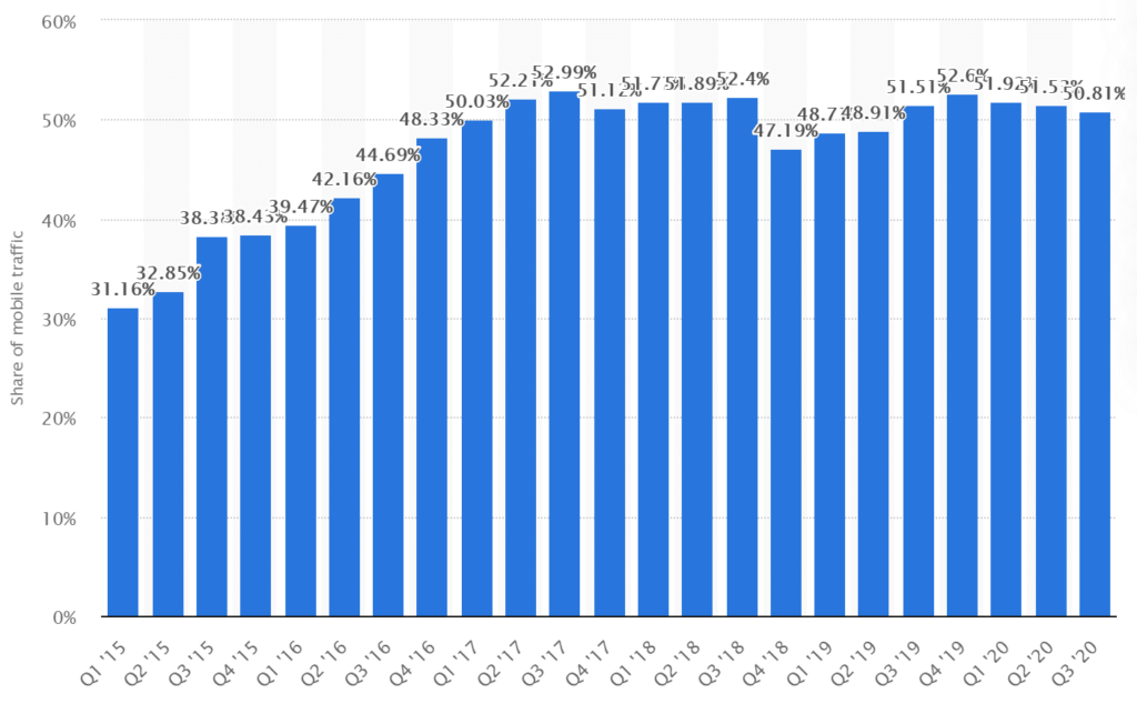
The graph above shows the increase in mobile traffic since 2015, it’s only going to go up from here!
Social Media + Responsive Design = $$$
Chances are if you’re using Instagram or Facebook you’re probably doing so on a mobile device.
Picture this scenario: You’re scrolling through Instagram and see a pair of shoes you LOVE! You click the link in the Instagram bio and are met with a website that is a jumble of pictures and words. I bet it doesn’t take you long to exit back to Instagram and keep on scrolling.
Now if you’re a business owner, doesn’t that thought send shivers through your spine? By not having a mobile responsive website you are losing customers!
Search Engine Optimisation (SEO)
It wouldn’t be right if I didn’t mention SEO! Google recommends mobile responsive design, and I know they aren’t the only search engine out there – but they are the big boys in the schoolyard!
Google’s aim is to provide quality content to people who use their search engine. They don’t care if you have the most amazing product ever invented, they care that you have an amazing website to display your product!
Check out their free Mobile-Friendly Check to see how your website scores!
So is your website mobile responsive?
There are a few ways you can check;
- If you haven’t already done so, head to Google’s free Mobile-Friendly Check and enter your URL.
- When building websites or making changes and updates I use Responsive Design Checker. It is a free online tool that allows you to view your website in whatever screen size you want. They have preset sizes or you can enter your own custom dimensions.
- Ask your friends and family! Ask them to visit your website on their mobile phone or tablet and give you feedback!
If your website is not mobile responsive and you need some help, head to my contact page and fill in the form. I’d love to help you out!