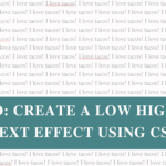
This week, I added hidden Easter eggs to my site – little surprises that appear when you hover over certain letters.

Why? Because I can. And because coding should be fun (plus, it’s a fun way to keep my CSS skills sharp).
Hover over this sentence to see it in action!
If you want to add a playful touch to your site, here’s how to do it with pure CSS.
As we all know, I’m a WordPress girlie, so these instructions are specific to building with WordPress (but the technique can be applied to any CMS).
Step 1: Mark the letters
Wrap any letter (or word, or image, or element) you want to be “Easter eggified” in a <span> with a class like this:
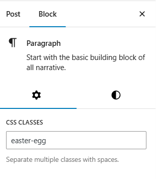
<span class="easter-egg">Happy Easter!</span>If you’re using the Gutenberg block editor, you can add a CSS class in the block settings, but keep in mind this will apply to the entire block, not individual words or letters.
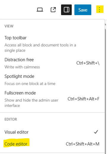
To apply the effect to a single word or letter, you’ll need to either:
- Switch to the Code editor and manually wrap the word in a
<span>with the class - Or use a Custom HTML block if you’re comfortable writing the snippet directly
That way, the effect only applies to the text you wrap – not the whole block.
Step 2: Add the CSS
Add the CSS that makes the egg appear when you hover. You can add this by going to Appearance > Customise > Additional CSS.
.easter-egg {
  position: relative;
}

.easter-egg:hover::before {
  content: "";
  position: absolute;
  width: 30px;
  height: 30px;
  background-image: url('https://shannonpayne.com.au/wp-content/uploads/2025/04/pink-egg.png');
  background-size: contain;
  background-repeat: no-repeat;
  top: -10px;
  left: -10px;
  z-index: 10;
}
Here’s what each line of the CSS does, in plain English:
position: relative;– added to the span so the egg image can be positioned relative to it, instead of the whole pagecontent: "";– this is required to make the::beforeelement appear, even if it’s just displaying an imageposition: absolute;– allows the egg image to float and be positioned on top of the hovered elementwidth: 30px;– sets the widthheight: 30px;– sets the heightbackground-image:– the URL of your egg image. You can upload it to your Media Library and paste the link herebackground-size: contain;– it “contains” the image to fit inside the box so that it isn’t croppedbackground-repeat: no-repeat;– ensures the egg image appears only once (not tiled or repeated)top: -10px;– moves the egg up slightly above the hovered element. You can adjust this based on where you want the egg to appearleft: -10px;– shifts the egg slightly to the left. Again, tweak as needed for placementz-index: 10;– brings the egg image to the front so it appears above the text
The parts you will likely tweak to suit your website would be the width, height, background-image, top and left.
Have fun with it!
This technique isn’t just for Easter eggs – you can use it to reveal anything on hover:
- Different images for different letters
- Hearts, stars, or icons
- Seasonal surprises like pumpkins or snowflakes
- Hover effects on CTA buttons, icons, or headings
It’s a small detail, but a fun one that adds personality to your site.
Seen any other cool effects on a website and wondered how to do it? Let me know and I’ll do a write-up!